


The Relationship Between Shadows, Highlights, and Color Perception in Photography
.png)
Have you ever taken a photograph of a vibrant red rose under the midday sun, only to find that the image looks washed out and slightly orange? Or perhaps you've noticed that the shadows in your landscape portraits appear distinctly blue, even though the grass is green and the dirt is brown.
These aren't errors in your camera sensor. They are
fundamental aspects of how light interacts with matter and, more importantly,
how human eyes perceive color across different luminance levels. Photography is
often described as "painting with light," but a more accurate
description might be "painting with contrast." The relationship
between the brightest parts of your image (highlights) and the darkest parts
(shadows) does more than establish exposure; it dictates the color identity of
your subject.
The Science of Luminance and Hue
To understand why colors shift in the dark or the
light, we first need to separate color into its three core components: hue,
saturation, and luminance. Hue is the actual color (red, blue, green).
Saturation is the intensity of that color. Luminance is the brightness.
While we tend to think of these as separate sliders in
Lightroom or Photoshop, in the physical world, they are inextricably linked. As
the intensity of light changes, our perception of hue and saturation changes
with it.
The Bezold–Brücke Effect
This phenomenon explains why that red rose looked
orange in the bright sun. The Bezold–Brücke effect describes a visual illusion
where luminance alters hue perception. As light intensity increases, colors
appear to shift toward yellow or blue—red shifts toward yellow (appearing
orange), and green shifts toward yellow (appearing chartreuse).
For photographers, this means that high-key lighting
setups or shooting at noon won't just make your image brighter; it will
fundamentally shift the color palette. If you are shooting a product where
color accuracy is paramount, managing your highlights becomes a critical task.
The Abney Effect
Another psycho-visual phenomenon is the Abney Effect,
which deals with saturation. It states that adding white light to a
monochromatic light source (desaturating it) doesn't just make the color paler;
it changes the perceived hue. For instance, if you desaturate a rich violet
light by adding white, it will appear to shift toward blue.
These effects prove that our eyes are not objective
meters. They are subjective interpreters of data, heavily influenced by how
much light is hitting the retina.
The Role of Highlights in Color Storytelling
Highlights are the brightest areas of your image. They
provide texture, shape, and volume. However, they act as a double-edged sword regarding color.
Specular vs. Diffuse Highlights
There are two main types of highlights you encounter in
photography, and they handle color very differently.
1.
Diffuse Highlights: These are the bright areas
where the light creates the actual color of the object. If you light a green
apple, the diffuse highlight is a bright, vibrant green. This is usually where
color saturation is at its cleanest.
2.
Specular Highlights: These are the direct
reflections of the light source itself—think of the tiny white glint in a
model's eye or the shiny spot on a chrome bumper. Specular highlights usually
mirror the color of the light source (often white or warm yellow) rather than
the object.
The Saturation Drop-off
As a general rule, as pixels approach pure white (255,
255, 255 on the RGB scale), saturation drops to zero. Pure white has no color.
This creates a natural gradient in bright images: as the highlight intensifies,
the color must desaturate.
Photographers often make the mistake of trying to force
saturation into blown-out highlights during post-processing. This rarely looks
natural because our brains expect bright, specular reflections to be
desaturated. Instead, allow your highlights to fade naturally into white or a
very faint tint of your light source (e.g., a pale warm yellow for sunlight).
Shadows: Where Color Goes to Hide
If highlights are where saturation fades into white,
shadows are where color can become rich and complex—or disappear entirely into
the abyss of pure black.
The Color of "Black"
In painting, black is a pigment. In photography, black
is the absence of light. However, in most real-world scenarios, shadows are
rarely pitch black. They are filled with "ambient" light.
Consider an outdoor portrait. The sun acts as the key
light, illuminating the face. The shadows on the face aren't black; they are
illuminated by the ambient light bouncing off the open blue sky. Consequently,
outdoor shadows almost always carry a blue or cool teal cast.
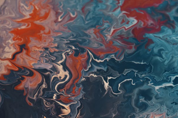
Color Grading and Visual Contrast
This natural occurrence—warm sunlight and cool shadows—is the basis for the "Teal and Orange" look that dominates
Hollywood blockbusters. It utilizes complementary colors to create visual
separation.
Our eyes find this contrast pleasing because it mimics
the natural world. When editing, if you neutralize the color in your shadows
completely (making them monochromatic grey), the image often feels sterile or
"digital." Allowing a subtle color tint to inhabit the shadows adds
depth and atmosphere.
The Danger of Crushed Blacks
Just as highlights lose color as they approach white,
shadows lose color as they approach black. "Crushing the blacks"
refers to pushing the dark tones of an image until they clip to absolute zero.
While high-contrast black-and-white photography
benefits from this, color photography often suffers. When you crush blacks, you
strip away the subtle blue or warm tones residing in the shadows, flattening
the image. To maintain a rich perception of color, you often need to lift the
deepest shadows just slightly above absolute zero, giving the color grading room to breathe.
Controlling Perception Through Exposure
Understanding the relationship between light levels and
color allows you to make intentional choices before you even press the shutter.
Exposing for Saturation
If your goal is deep, rich color, you should avoid
overexposure. A slightly underexposed image (protecting the highlights) will
often yield richer saturation than an image exposed to the right. This is
because mid-tones hold color data better than highlights do.
For example, landscape photographers shooting a sunset
will often underexpose the sky. If they were exposed for the foreground, the
sky would brighten, shifting the deep oranges to pale yellows and the rich reds
to pinks. By keeping the exposure lower, they maintain the integrity of the
deeper, more dramatic hues.
White Balance is a Creative Choice
We are taught that White Balance is a corrective tool—a
way to make white look white. But considering how light alters color, White
Balance is also a creative tool.
If you set your White Balance to "Daylight"
while shooting in the shade, your camera will capture the blue tint of the
shadows faithfully. If you set it to "Shade," the camera adds orange
to counteract the blue, "correcting" it.
But what if the mood of your photo is melancholy or
cold? Correcting that shadow blue removes the emotional context. A photographer
who understands perception might intentionally leave the White Balance cool to
enhance the blue shadows, reinforcing the cold feeling of the image.
Post-Processing: Putting Theory into Practice
Modern editing software gives us unprecedented control
over the relationship between tonal values and color. Here is how you can apply
these concepts in Lightroom or Capture One.
Split Toning (Color Grading)
The Color Grading wheels are the most direct
application of this theory. You can independently assign a hue to your Shadows,
Midtones, and Highlights.
1.
For a natural look: Push a subtle cool hue
(blue/teal) into the shadows and a subtle warm hue (orange/yellow) into the
highlights.
2.
For a vintage look: Try the inverse, or
experiment with lifting the blacks and adding a matte green or violet to the
shadows, mimicking old film stock.
Calibration
The Calibration tab allows you to shift how the camera
interprets the primary Red, Green, and Blue channels. This is often where the
"magic" happens. By tweaking the Blue Primary hue, you can shift how
distinct the separation is between skin tones (usually orange) and the
environment (often blue/green).
Luminance Curves
Standard contrast curves affect brightness, but they
also boost saturation (because increasing contrast pulls colors away from the
neutral grey middle). If you want to adjust the brightness of your highlights
without washing out the color, try using a specific "Luminance" curve
or blending mode if available in your software (like Photoshop). This changes
brightness without altering saturation values, preventing the Bezold–Brücke
effect from ruining your specific color palette.
.png=w151-h67-p-k-no-nu)

%20(2).png)

.png)


.png)
dadasdas
ReplyDelete